SumUp
Exploring New Possibilities with UX/UI Design!
In this study, we will delve into the dynamics of creating digital assets for promoting a product in the financial sector, exploring the opportunities offered by SumUp.
As Pix revolutionizes instant financial transactions in Brazil, SumUp stands out as an innovative fintech, providing financial solutions for small and nano merchants worldwide.
By understanding the financial context and usage, brand positioning, tone of voice, and visual universe, we will explore some creations and customization of communication emails, landing pages, and websites aimed at meeting the brand's outreach needs and customer loyalty.
Building Digital Assets for the Financial Sector Promoting Pix
In this project, I created "Key Visions" and landing page through for sumup with a strategic UX/UI process centered on user needs. I began with comprehensive research to understand the target audience, followed by the development of wireframes and prototypes to visualize the interface layout and navigation. This process led to a visually cohesive design aligned with the brand identity, optimizing user experience to enhance engagement and drive conversions. My approach not only meets client objectives but also delivers impactful solutions for the digital landscape.
| PROJECT DEVELOPMENT: SUMUP AND EBAC
The following project was developed with the support of the Escola Britânica de Artes e Tecnologia (EBAC) in partnership with SUMUP and PIX. Background research was presented to understand the financial context and brand usage, as well as the Brand Positioning, Tone of Voice, Visual Universe, Global Primary Colors, and market usage examples.
| customers
SumUp's clientele consists of small and nano merchants, who are individuals or small businesses. Small merchants typically have physical stores, such as coffee shops or local grocery stores, while nano merchants are individual entrepreneurs, like freelancers or online sellers. They have specific financial needs and seek affordable and user-friendly solutions, such as those offered by SumUp, including credit card machines and mobile payment solutions.


| OBJECTIVES
> Offer financial solutions for small and nano merchants;
> Expand the portfolio of products and services;
> Create and disseminate communication and engagement strategies.
> Expand the portfolio of products and services;
> Create and disseminate communication and engagement strategies.
| CHALLENGE: Building Digital Assets
The guidelines for creation were provided with the approval for creative freedom in defining colors, styles, and typography; however, the original typography was not permitted due to copyright issues. Among the deliverables were the development of communication emails, the creation of attractive and intuitive landing pages, and Key Visions.
| CONCEPTUAL MOODBOARD
| colors and typography
The chosen fonts reflect standards of legibility and application in different contexts, such as digital products and graphic design pieces, highlighting different sizes and weights for both mobile and web.
| GRaphic MOODBOARD
| low fidelity WIREFRAMES
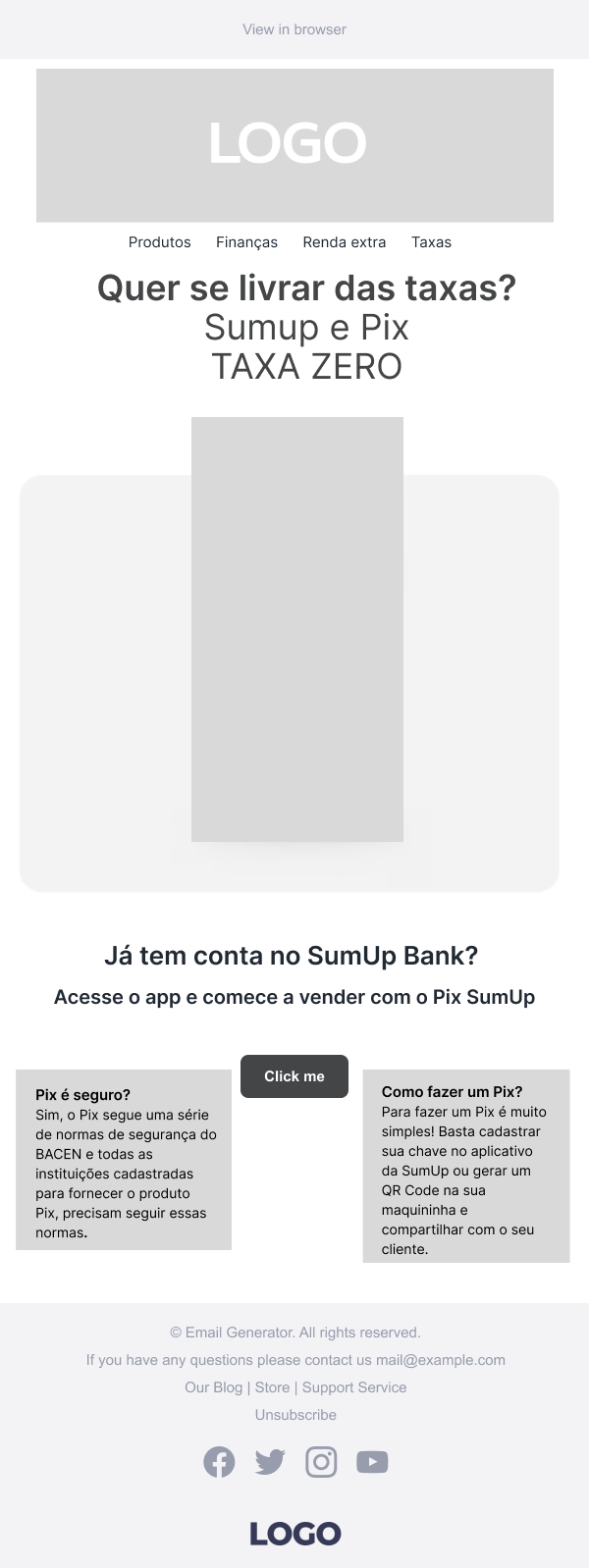
Communication emails are a way that companies use to inform, promote products and services, maintain contact with customers or followers, or share updates about a brand.


Landing Pages
Landing pages are web pages designed specifically for a single purpose or objective, usually related to a marketing campaign, product or service. They are created with the intention of converting visitors into leads or customers, through a clear and direct call-to-action (CTA).


| KEY VISIONS
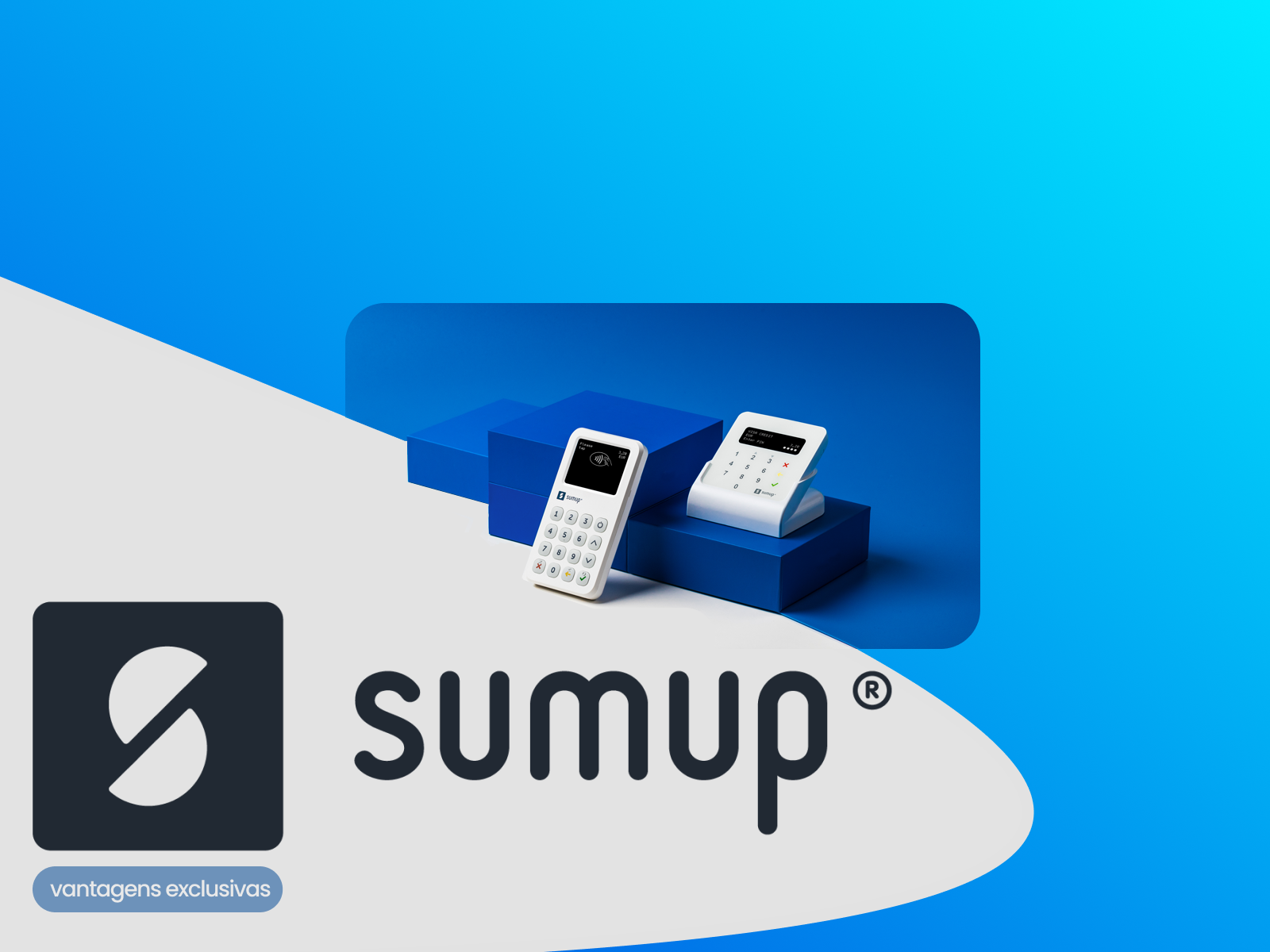
A "key vision" screen in UI (User Interface) is a fundamental or crucial screen in a user interface design project. This screen is considered essential because it plays a central role in the user experience or in achieving the goals of the product or service.
Three Key Vision screens were created, and the visual exploration of interfaces for each concept was defined in the moodboards. Throughout the process, the organization of elements in FIGMA was maintained, facilitating and streamlining the workflow.
Additionally, the creative direction and attention to detail were preserved to create three different interface pathways. The dimensions were set at 1600 x 1200 px.
| HIGH FIDELITY PROTOTYPES
| E-mail
| Landing Pages
| CONCLUSION
Leveraging the provided background, brand positioning, and understanding of the company's context enabled the creation of cohesive and engaging digital experiences. The freedom to define variations in colors, styles, and typography allowed for a unique visual expression, while the integration of Pix offers new opportunities for simplifying transactions and improving financial efficiency.
Finally, by exploring visual references and engaging with the characteristics, the digital assets can become not only functional but also aesthetically pleasing and aligned with the SumUp brand identity. This convergence between financial technology and user-centered design reflects a present and future concern for users, with a commitment to providing quality products for commerce, bringing greater accessibility, convenience, and effectiveness for all stakeholders in key business areas.
